The Asset Utilization report provides visibility into the scope of your service virtualization efforts over a specified time frame. It helps you explore metrics such as:
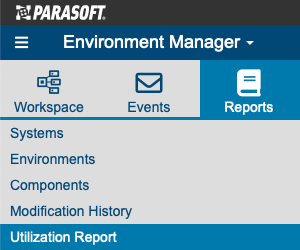
To access the asset utilization report, open the Service Virtualization module's Reports tab and click Utilization Report.
Use the available controls to specify the time frame for which you want to review asset utilization. Note that the "count" summaries shown on the report (for example, asset count, proxy count, hit count, and coverage agent summaries) are based on the count at the end of the specified time frame.

Throughout the report, certain elements are assigned specific colors to help visualize them:
The report contains three main sections: the heat map, the trends chart, and the details section.
The heat map is an interactive, highly customizable report. You can focus on virtual assets, systems, environments, folders in the VirtualAssets project in Virtualize, Virtualize servers, or coverage agents by selecting the desired focus from the menu in the top left.
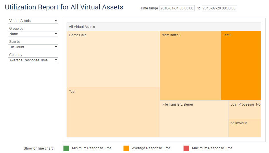
From there, you can group the results (if desired) as well as determine what metric is used to size and color the results. Colors will be shaded to represent higher (darker shade) and lower (lighter shade) counts.
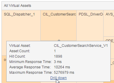
To see detailed metrics for a specific block, hover over the block and review the tooltip that opens. To open a dedicated heat map for that block, click the Drill Down link in the tooltip.
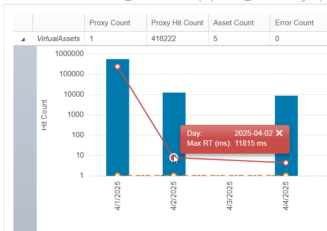
The trends chart summarizes the average values for key metrics over the selected time period and illustrates how those metrics vary over time.
In the summary row at the top of the table, averages are calculated over the selected time period and "counts" represent the totals at the end of that time period.
Note that the focus of the trends chart is the same as the focus of the heat map. Both are controlled by the menu in the top left of the page.

Use the options above the chart to hide/display specific metrics in the chart. You can choose to view metrics related to hits per second or response time.

Mouse over a point in the graph to open a tooltip with details.
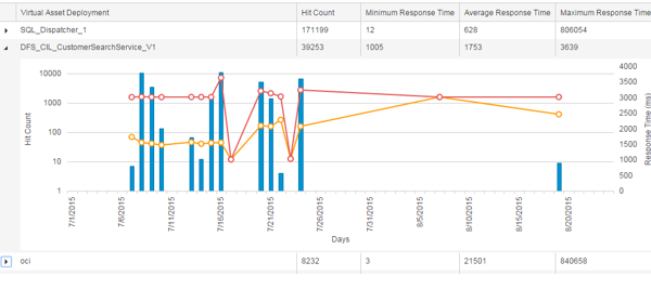
The details table provides details on the individual items (virtual assets, systems, environments, coverage agents, folders in the VirtualAssets project in Virtualize, or Virtualize Servers) within the category you’ve set as the report focus. For instance, if you are focusing on systems, the details table will report virtual asset usage metrics for each system available on this installation of CTP.
Each table row indicates the values for key metrics; averages are calculated over the selected time period and "counts" represent the totals at the end of that time period. To see a chart of how these values varied over time, expand the row, and review the chart that displays.
You can export the Utilization Report to a CSV file. The following options affect what data is included in the export:
Click the Export to CSV icon on the toolbar along the top of the screen (if the navigation sidebar is open) or left of the screen (if it is not), then click the link in the dialog that opens to download the CSV file.