...
Note that the focus of the trends chart is the same as the focus of the heat map. Both are controlled by the menu in the top left of the page.
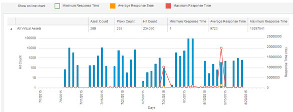
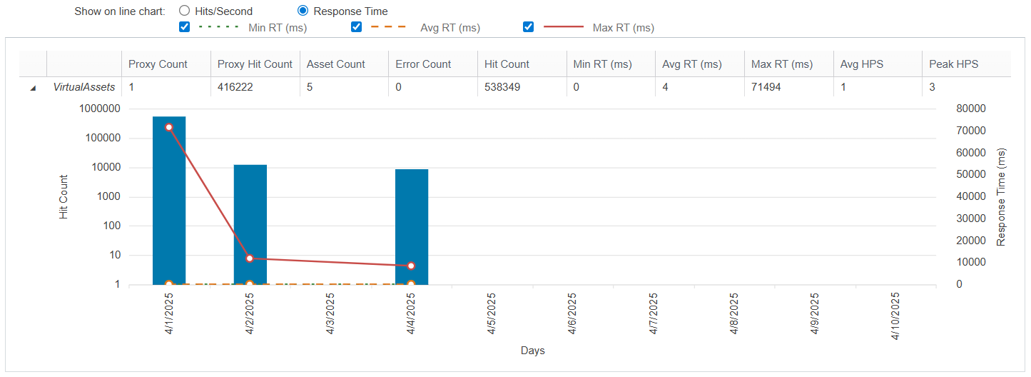
Use the boxes options above the chart to hide/display specific metrics in the chart. You can choose to view metrics related to hits per second or response time.


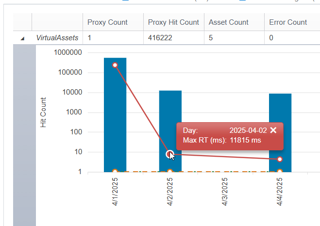
Mouse over a point in the graph to open a tooltip with details.

Details Table
The details table provides details on the individual items (virtual assets, systems, environments, coverage agents, folders in the VirtualAssets project in Virtualize, or Virtualize Servers) within the category you’ve set as the report focus. For instance, if you are focusing on systems, the details table will report virtual asset usage metrics for each system available on this installation of CTP.
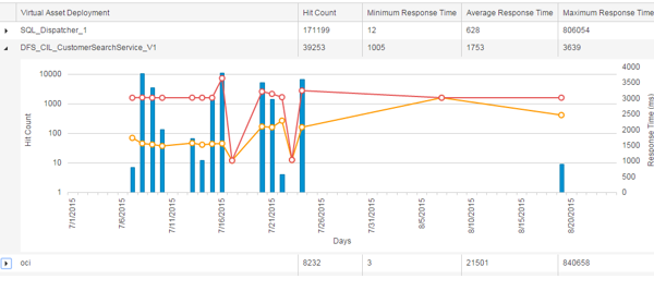
Each table row indicates the values for key metrics; averages are calculated over the selected time period and "counts" represent the totals at the end of that time period. To see a chart of how these values varied over time, expand the row, and review the chart that displays.
Exporting to CSV
You can export the Utilization Report to a CSV file. The following options affect what data is included in the export:
- Date range
- List all
- Group by
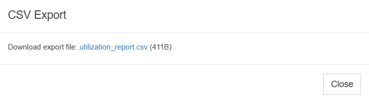
Click the Export to CSV icon on the toolbar along the top of the screen (if the navigation sidebar is open) or left of the screen (if it is not), then click the link in the dialog that opens to download the CSV file.